MENU CLOSE

Brand Manual | Whetsel

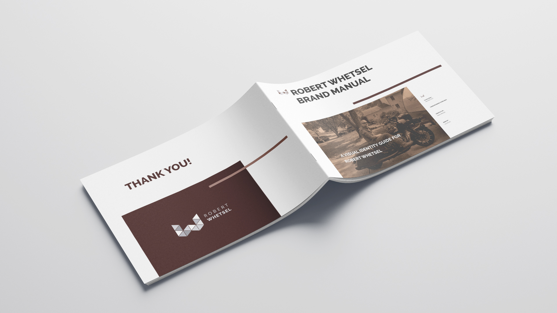
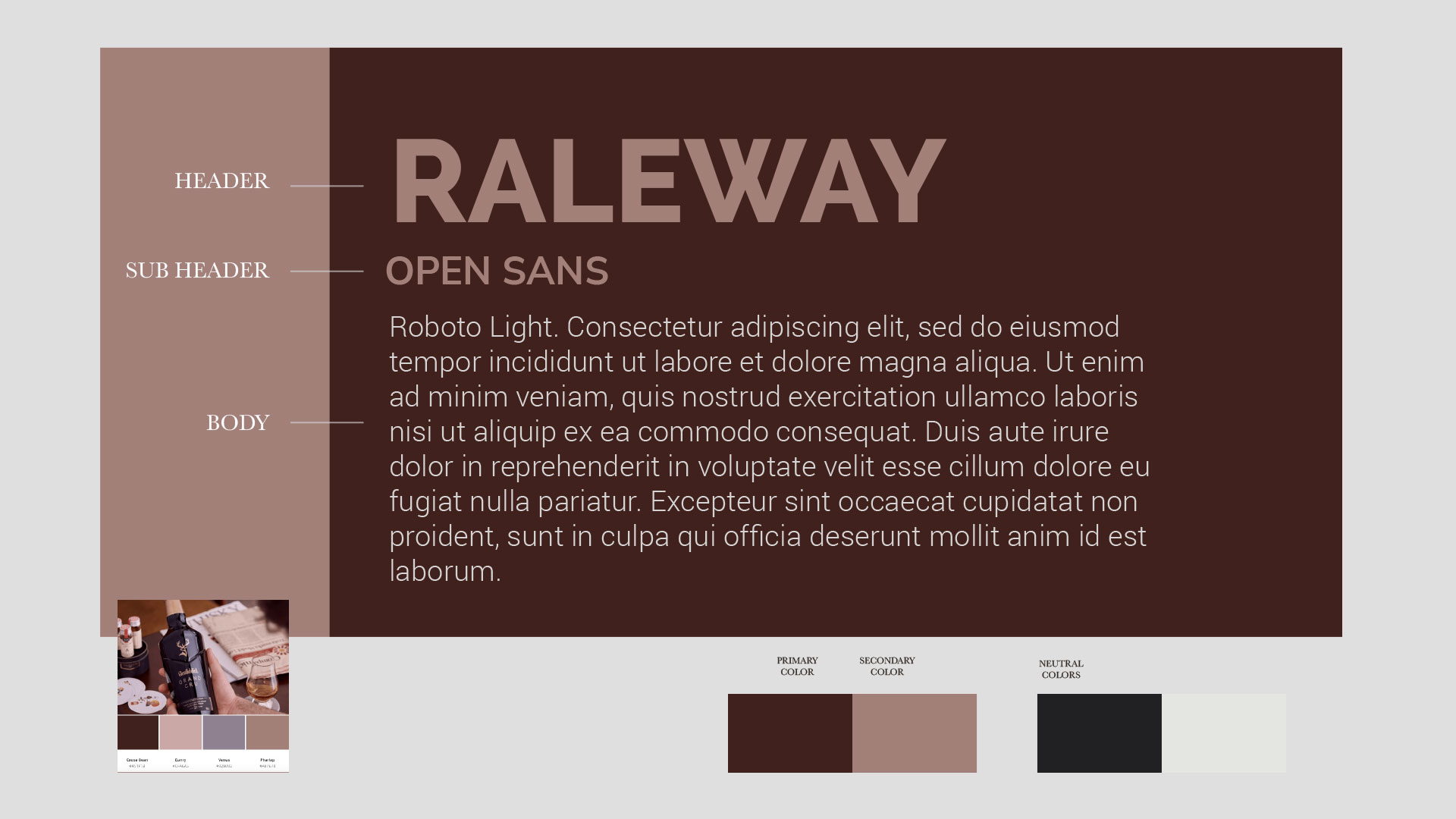
Robert Whetsel is the brand name from the client’s name. Dr. Robert Whetsel is planning to retire as a government officer. To prepare his career for becoming a consultant, he asks for personal branding. At first, he has a vague idea of what he wants. Understanding that he comes from different professional industry, and he is a very organized person, I suggest if he would like to start for a brand manual before working on marketing collateral. A brand manual is like a bible for branding. It contains the logo design, usage, restrictions, color, font, and image guides. The best thing with a brand manual is that he can hand it to different people on his team while still producing consistent visual on his marketing collateral and other projects. He loved the idea.

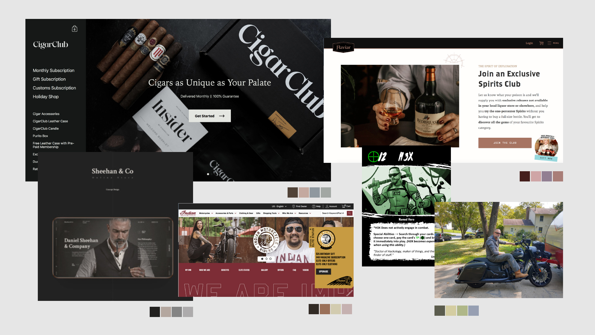
In the early stage, I was developing a service brand. During the work in progress, he sent me images he likes, his hobbies, and his day-to-day look. He needs personal branding and not service branding of his offers.

Sometimes a client’s requirement becomes apparent only during the process, when they saw something visually.

Cover and back design of the brand manual

THE PROCESS

THE LOGO

Logo is a combination of typography, graphic symbol, and color. These elements summarize the visual identity of a brand. So, it is apparent to start the branding development with a logo design. Base from our initial discussion, I picked up that the client’s service strength are strategy and synergy. He wants an abstract type of logo. I sent Dr. Robert these three studies for selection.

Study #1: Two elements pointing inwardly. Similar to Yin Yang concept, this logo concept suggests synergy. That is, the ability of Dr. Whetsel of simplifying a complex situation.

Study #2: These are merging elements of a chess piece knight (horse) and symbol of digital or data (various-sized square shape). These are the icons for combination of strategy and digitation, which I believe, the strength of the service Dr. Whetsel offers.

Study #3: Low poly style of Whetsel’s initial surname. Triangles interconnected, forming similar to a puzzle. This suggests fitting in, connectivity, and balance.

The client chose study #3.

Logo study #1
Study #1: Two elements on synergy.
Study #2: Strategy + digitation
Study #3: Low poly style of letter "W".

THE MOODBOARD

Dr. Robert started sending me images of hobbies and organizations he belongs. I really like this initiation, even without asking him. I got a better picture of the image he wants to project. Synthesizing the visual brand from the sites and pictures he sent enables me to build a visual brand of his own easily.

Moodboard

FONT AND COLOR

The moodboard contains almost the same color palette. So it becomes easier to choose. I picked Raleway and Nunito Sans for the typefaces. They are both free downloadable from Google. If given discretion, I always choose Google Fonts. Simply because they are free and displaying fonts on online platforms would cause no problem.

Raleway is an elegant sans serif typeface. It extrudes minimal and modern feel. Nunito Sans is also a sans serif typeface. It has a modern, clean, and approachable look. Both typefaces gives an impression of solid and crisp look.

This is the combination he approved of the choices I sent him, inspired by the color palette of wine. Because wine, as a metaphor, becomes better as it aged.

Font and Color System

Final output

The Brand Manual Guide

This is the 24 page first volume of the brand manual guide we completed. Working next on Dr. Robert’s other material like website would be easier after laying the guidelines.